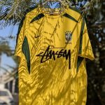
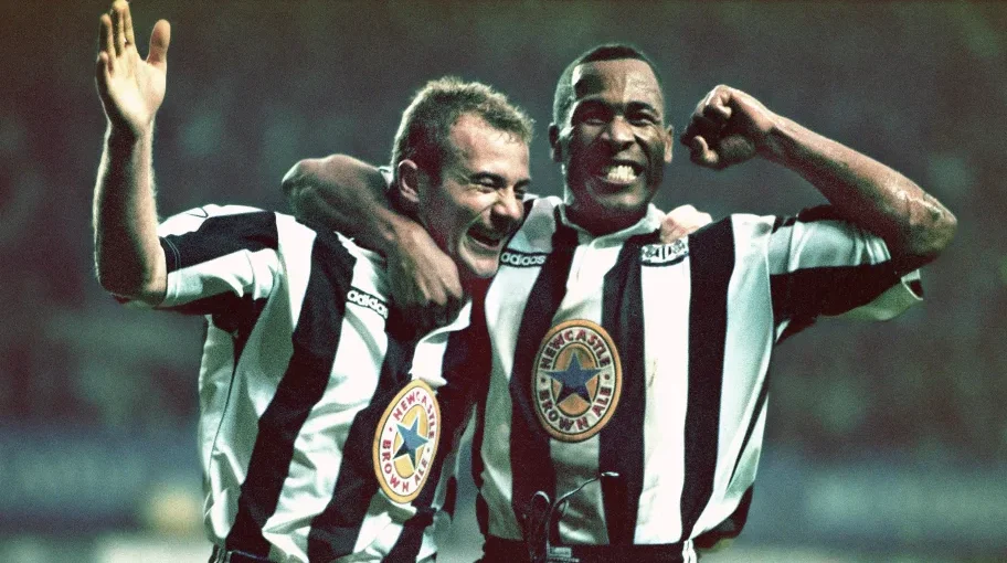
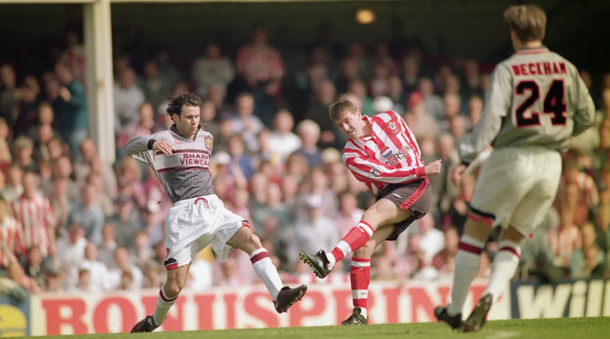
Football kits are one of the major elements that define a club’s identity, a statement of pride, and a major revenue stream. But sometimes, clubs (or their kit manufacturers) drop the ball, launching designs so baffling that fans wonder, “Who signed off on this?” Color catastrophes or bizarre sponsorships, here are the worst kit launches in football history and how the internet reacted.
1. Newcastle’s ‘Prison Barcode’ Kit (1995-96)
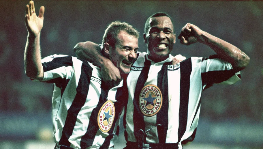 Newcastle United’s 1995-96 away kit looked less like a football jersey and more like something you’d scan at a supermarket checkout. With its bold black-and-white vertical stripes and a massive Blue Star sponsor logo slapped in the middle, it quickly became a laughingstock. Fans compared it to a prison uniform, and to this day, it’s a reminder that simplicity isn’t always a bad thing.
2. Hull City’s ‘Tiger Stripes Gone Wrong’ (1992-93)
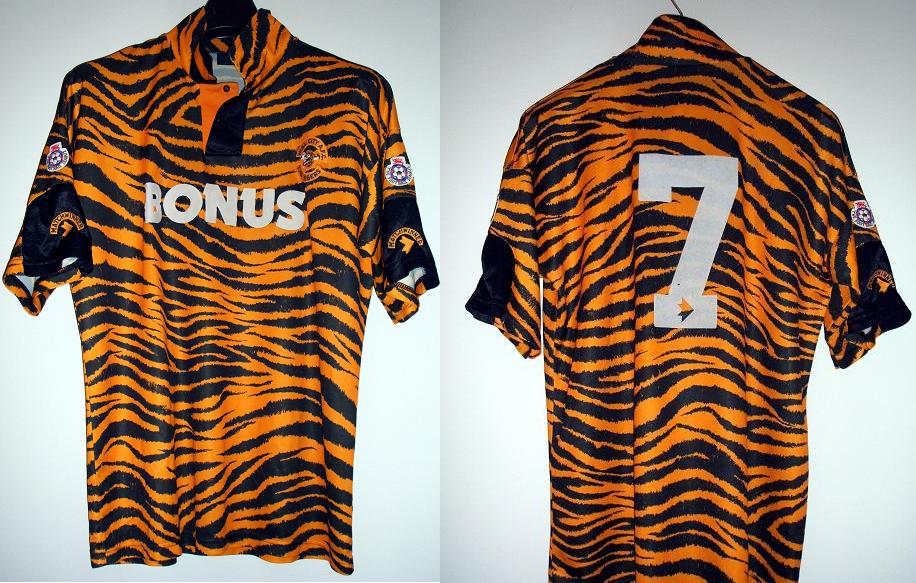
We get it—Hull City are the Tigers. But did they really need to take it so literally? Their 1992-93 home kit featured a garish tiger-stripe pattern that made players look more like jungle escapees than professional footballers. Fans were horrified, and it’s still regarded as one of the ugliest kits ever designed.
3. Spain’s ‘Blood-Stained’ Jersey (2016 Away Kit)
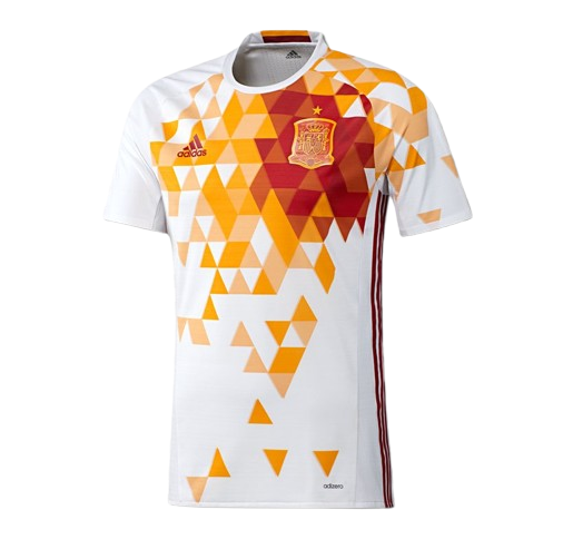
Adidas tried to get creative with Spain’s 2016 away kit, incorporating red and yellow geometric patterns inspired by the nation’s flag. Instead, it ended up looking like a crime scene. Fans quickly pointed out that the design resembled blood stains, and social media had a field day. Despite the backlash, the team stuck with it—awkwardly dodging ‘stab wound’ jokes throughout the tournament.
4. Manchester United’s ‘Zebra’ (2020-21 Third Kit)
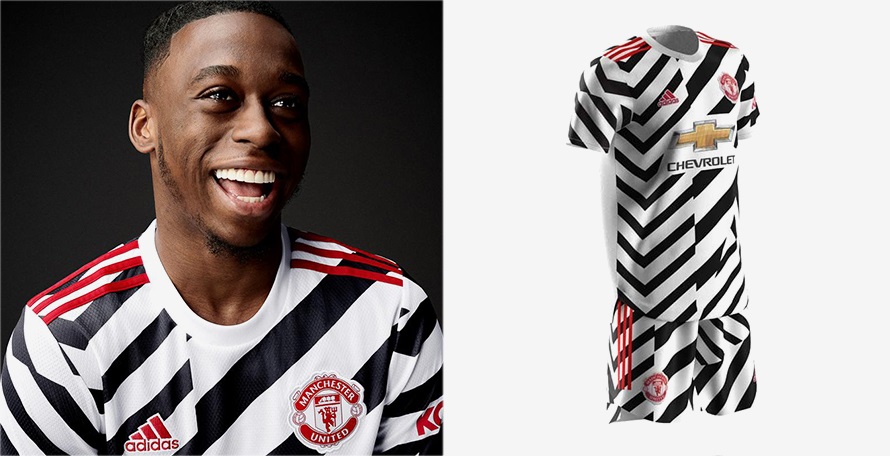
Manchester United’s 2020-21 third kit was supposed to be a nod to the club’s rich history of bold designs. Instead, it looked like a referee’s worst nightmare. The chaotic black-and-white zigzag pattern was widely ridiculed, with fans comparing it to a Magic Eye puzzle. The kit quickly earned the nickname ‘The Zebra Kit’, and while some eventually grew to like it, the initial reaction was brutal.
5. Juventus’ Not Ugly But Just Meeeeh (2019-20 Home Kit)
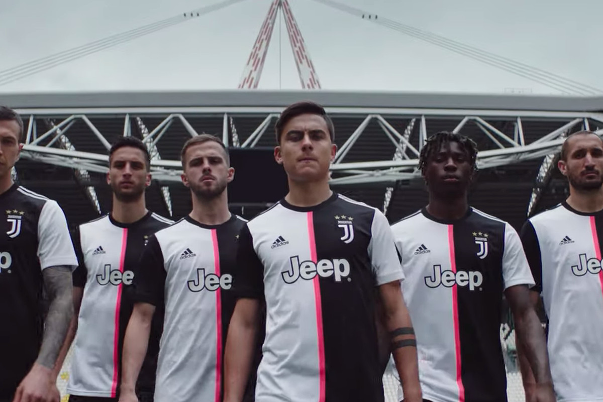
Juventus are known for their iconic black-and-white stripes—but in 2019-20, Adidas decided to ditch them for a half-and-half design separated by a random pink stripe. Fans were furious, claiming it looked more like a training top than a proper Juventus jersey. The club’s kit identity felt lost, and even some of the players weren’t thrilled about the change.
6. Norwich City’s ‘Bird Poop’ Kit (1992-94)
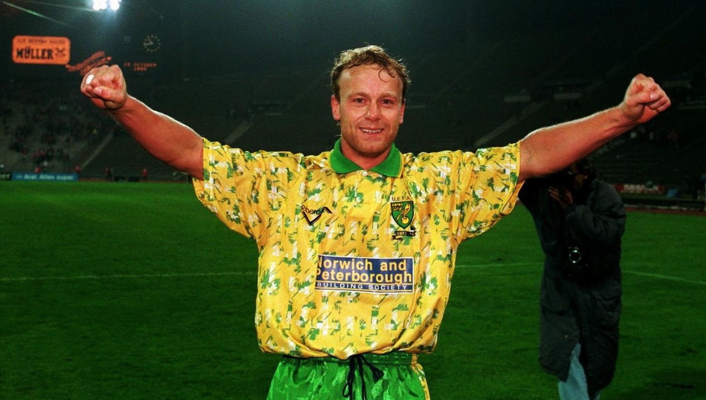
Norwich City’s kit launches were meant to be bold and vibrant. Instead, this time, it looked like someone had thrown a bucket of paint (or worse) at it. The green splatter effect made it appear as though a flock of birds had attacked it mid-flight. Fans weren’t impressed, and it remains one of the strangest design choices in football kit history.
7. Cameroon’s Sleeveless Kit (2002)
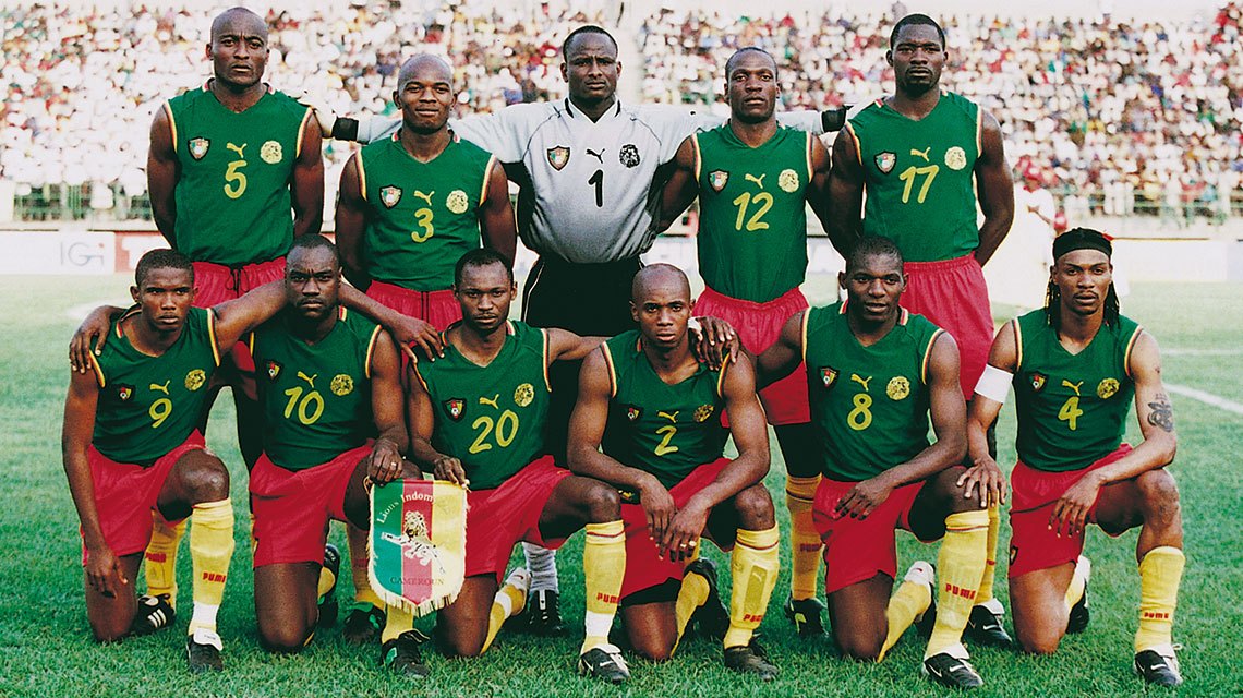
In 2002, Cameroon decided to break every football kit tradition by introducing a sleeveless jersey. Designed by Puma, the kit was meant to symbolize speed and power—but FIFA wasn’t having it. The governing body banned the kit, forcing Cameroon to stitch on makeshift sleeves before they could compete at the World Cup. The controversy made headlines worldwide, but at least the players got to show off their arms.
AND PERSONALLY, I LOVE THIS KIT!!!
The aftermath: How clubs handle kit launches disasters
When a kit is met with widespread ridicule, clubs have two choices: stick with it and hope it grows on fans, or ditch it for a redesign. Some, like Manchester United and Juventus, have had to endure a full season of mockery, while others, like Cameroon, faced immediate intervention from football authorities.
But here’s the thing—sometimes, the worst kits end up becoming cult classics. Years down the line, fans often look back at these disasters with a sense of nostalgia (or irony) and start collecting them for their sheer ridiculousness.
Football jerseys are meant to be bold, expressive, and symbolic of a club’s identity. But when that creativity goes unchecked, we get disasters like these. Whether it’s questionable patterns, terrible sponsors, or just complete design misfires, these kits remind us that even the biggest clubs can get it wrong.
Would you dare wear any of these? Or do you own a jersey that deserves a spot on this list? Let us know in the comments!
And if you’re looking for jerseys that actually look good…
Check out our latest collection of football jerseys and rep your team in style!